Designing Anveshana: when a photobook becomes a yatra
- Feb 14, 2024
- 5 min read

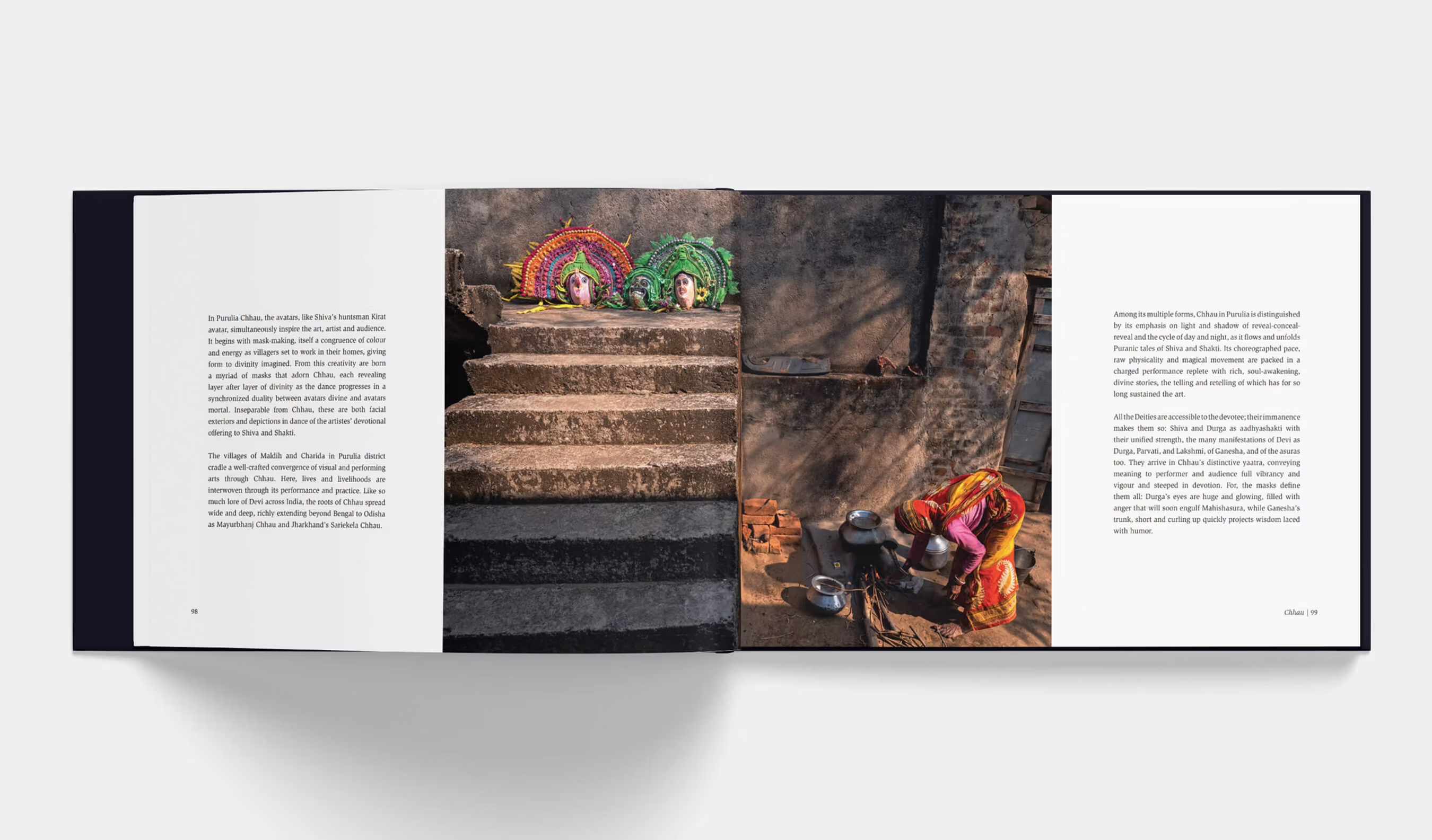
Anveshana is built like a journey—less “photo album,” more “theertha-kṣetra map.” Conceived as a coffee-table book born from the Indica Culture Photography Grant (ICPG) 2021, it brings together portfolios from eight grantees and prose that frames the work as a search—an anveshana—for meaning across communities and landscapes.
But what makes the book’s design memorable isn’t only what it contains—it’s how the content is orchestrated: photography, ethnographic notes, and hand-drawn interventions braided into a single reading rhythm. Tacit’s editorial approach intentionally intertwines photo-exhibit energy with documentary clarity, guiding readers through lives across seven diverse Indian geographies.
1) The central design idea: exhibition, translated into a book
A strong photobook doesn’t simply “present” images—it paces them. Anveshana borrows from the logic of a gallery exhibition:
Sequencing as movement: portfolios feel like rooms you enter and exit, rather than chapters you “complete.”
Breathing space: generous pauses (white space, short text breaks, shifts in density) simulate the silence you get between frames on a wall.
Context without clutter: ethnographic documentation is integrated so it supports the photographs instead of competing with them.
That exhibition-like cadence is crucial for the subject matter: the book invites you to witness the “gentle, spiritual essence of common folk,” and to experience India as a plural, rooted terrain—a continent within a country, expressed through everyday devotion. (This is the emotional promise the design must carry.)
2) Ethnography as an editorial “handrail,” not a lecture
Ethnographic content in photobooks can easily become heavy—either too academic, or too sparse to be useful. The design strategy here is more like a handrail on a path:
Placed at moments of need: text shows up when the reader might ask “where am I, who am I with, what am I missing?”
Modulated tone: short, readable blocks that respect coffee-table browsing, while still offering documentary weight.
Hierarchy that stays humble: typography and layout prioritize the image; text feels like accompaniment.
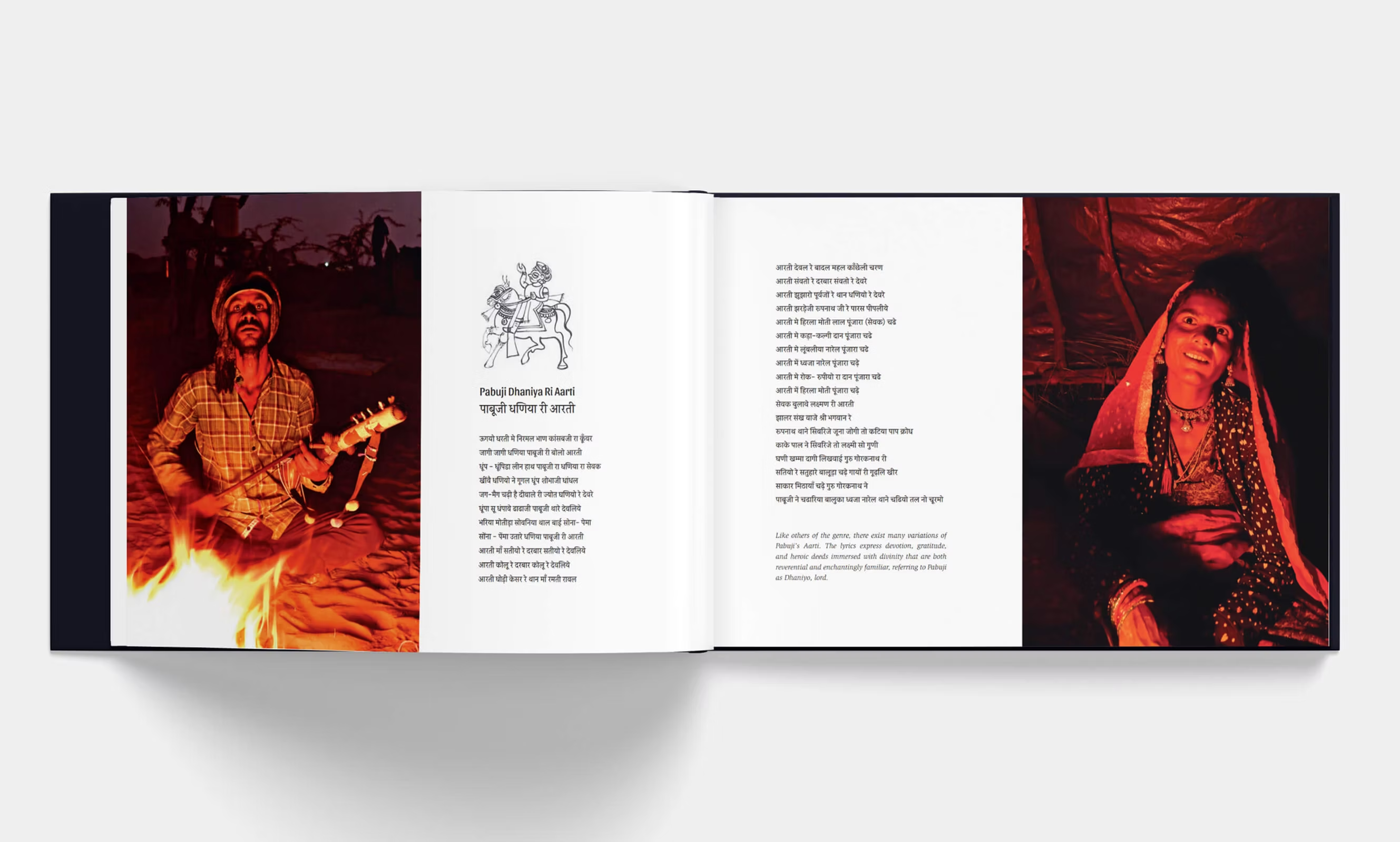
3) The sketches: human warmth, lived observation, and “texture”
Tacit describes “lively handdrawn sketches” as a key ingredient—these are more than decoration. (Tacit Design)They function like:
Field-notes made visible: a nod to the ethnographic tradition—observing, recording, witnessing.
A bridge between photographer and reader: sketches feel like a person was there, paying attention.
Rhythmic contrast: against photographic realism, the linework introduces interpretation and breath.
In a book about yaatris and living traditions, this “handmade layer” is also thematically aligned: it keeps the storytelling grounded in the human hand, not just the camera lens.
4) Type as voice: Slimbach for trust, Sansita for warmth
A lot of the book’s personality comes from its type pairing: ITC Slimbach + Sansita. Tacit calls out the combination directly, and it’s a smart one.
ITC Slimbach: clarity, scholarship, timelessness
ITC Slimbach is designed by Robert Slimbach and is known for being a highly readable text serif with calligraphic warmth—classic enough for long-form reading, lively enough to avoid stiffness. In Anveshana, that “clean serif shape” helps the ethnographic and curatorial writing feel credible, quiet, and bookish.
Sansita: expressive counterpoint
Sansita (by Pablo Cosgaya / Omnibus Type) explicitly explores the relationship between typography and calligraphy; it’s warm, flavorful, and ideal for short emphatic moments like headings or display lines. Used thoughtfully, it signals: this is not sterile documentation—it’s lived culture, spoken rhythm, human presence.
Why the pairing works
Together, these fonts create a “two-voice system”:
Slimbach = the narrator (steady, legible, archival)
Sansita = the guide (warm, expressive, invitational)
That duality mirrors the book’s thesis: documentation + devotion; record + reverence.
5) Designing “Bharat as plurality”: keeping seven geographies coherent
A multi-portfolio project risks feeling like an anthology without a spine. The design challenge is to maintain:
Cohesion (so the book feels like one object)
Distinctiveness (so each geography/community retains its own identity)
This is where consistent editorial rules matter—repeatable systems for headings, captions, intros, and visual transitions—while allowing the photography to dictate mood shifts. Tacit’s “seamless integration” language suggests that consistency was achieved without making the book feel templated.
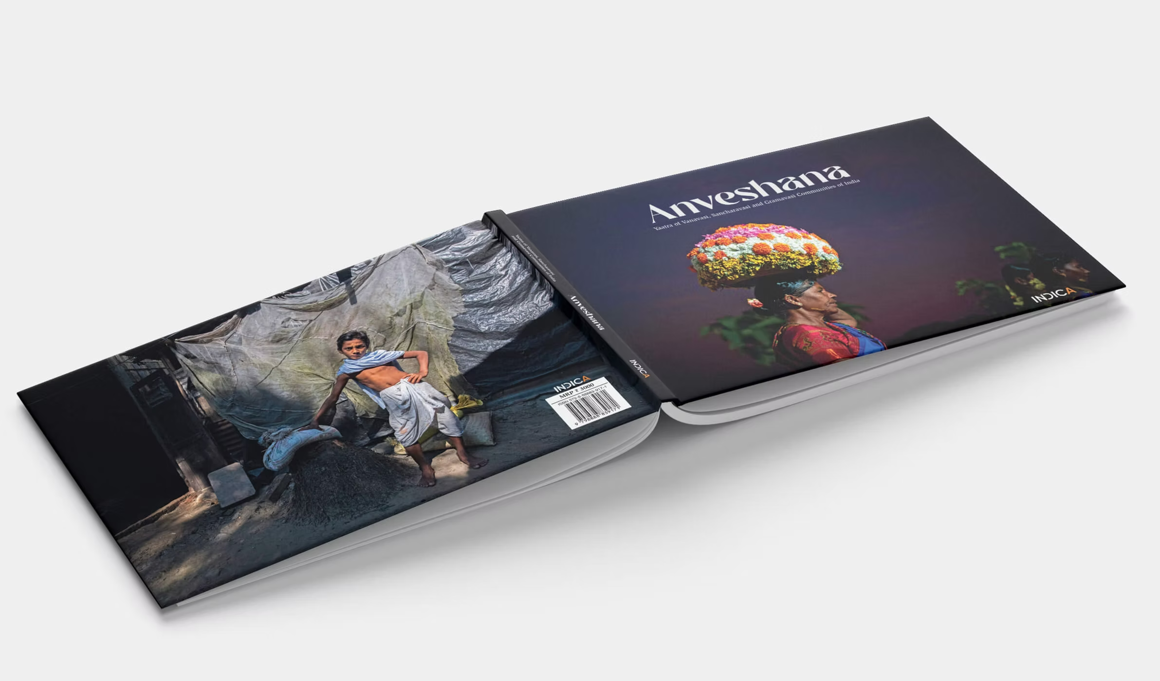
6) The object: coffee-table presence, but with documentary intent
As a coffee-table book produced under ICPG 2021 and published under Indica’s Chitraayana platform, Anveshana must work in two modes: display and depth.
That means covers and opening spreads need immediate magnetism (a “pick me up” moment), while the inside needs sustained pacing and readability (a “stay with me” structure). The design choices—mixed visual languages, friendly typography, and travel-like sequencing—support that dual life.
Closing: Design as invitation to Anveshana
At its best, Anveshana doesn’t ask you to consume images; it asks you to travel with attention. The interplay of exhibit-style sequencing, ethnographic scaffolding, sketches as embodied annotation, and a type system that balances trust with warmth results in a book that feels less like a product and more like a yatra: rooted, curious, and quietly revelatory.
Buy Book at
In Kannada
ಅನ್ವೇಷಣ ಪುಸ್ತಕವನ್ನು ವಿನ್ಯಾಸಗೊಳಿಸುವುದು ಮೂಲತಃ ಒಂದು ಪ್ರಯಾಣವನ್ನು “ಪುಸ್ತಕ-ವಸ್ತು”ವನ್ನಾಗಿ ಅನುವಾದಿಸುವುದರ ಬಗ್ಗೆ. ಇದು ಸರಳವಾಗಿ ಛಾಯಾಚಿತ್ರಗಳ ಸಂಗ್ರಹವಾಗಿರದೆ, ಕೈಯಲ್ಲಿ ಹಿಡಿದುಕೊಳ್ಳಬಹುದಾದ ಒಂದು ಪ್ರದರ್ಶನದಂತೆ ರೂಪುಗೊಂಡಿದೆ—ಇಲ್ಲಿ ಲಯ, ವಿರಾಮಗಳು, ಮತ್ತು ಬದಲಾವಣೆಗಳು (transitions) ಓದುಗನನ್ನು ಜನರು ಮತ್ತು ಸ್ಥಳಗಳ ಮೂಲಕ ಹಾಗೆ ಕರೆದುಕೊಂಡು ಹೋಗುತ್ತವೆ, ನೀವು ಗ್ಯಾಲರಿಯ ಗೋಡೆಯಿಂದ ಗೋಡೆಯಿಗೆ ನಡೆದುಕೊಂಡು ಹೋಗುತ್ತಿರುವಂತೆ. ಈ ದೃಷ್ಟಿಕೋಣ ಮುಖ್ಯ, ಏಕೆಂದರೆ ವಿಷಯ ಕೇವಲ ದೃಶ್ಯಾತ್ಮಕವಲ್ಲ; ಅದು ಅನುಭವಾತ್ಮಕವಾಗಿದೆ. ವಿನ್ಯಾಸವು ಪ್ರಯಾಣ, ಅನ್ವೇಷಣೆ, ಮತ್ತು ಮರಳುವಿಕೆಯ ಭಾವವನ್ನು ಹೊತ್ತು ಸಾಗಬೇಕು—ಭಾರತವು ದೈನಂದಿನ ಬದುಕಿನೊಳಗೆ ಹೇಗೆ ಅನಾವರಣಗೊಳ್ಳುತ್ತದೆ ಎಂಬುದನ್ನು, ಬೇರುಬಿಟ್ಟ, ಆಧ್ಯಾತ್ಮಿಕ, ಮತ್ತು ಆಳವಾಗಿ ವೈವಿಧ್ಯಮಯ ಜೀವಿತಗಳ ಮೂಲಕ ತೋರಿಸಬೇಕು.
ವಿನ್ಯಾಸದ ಪ್ರಮುಖ ಬಲವೆಂದರೆ ಅದು “ನೋಡುವ” ಎರಡು ವಿಧಾನಗಳನ್ನು ಒಂದಾಗಿ ಜೋಡಿಸುವ ರೀತಿ: ಫೋಟೋ ಪ್ರದರ್ಶನದ ತಕ್ಷಣಿಕತೆ ಮತ್ತು ಎಥ್ನೋಗ್ರಾಫಿಕ್ (ಜನಾಂಗಶಾಸ್ತ್ರೀಯ) ದಾಖಲೀಕರಣದ ಸೂಕ್ಷ್ಮ ಗಮನ. ಫೋಟೋಗಳು ಮುನ್ನಡೆಸುತ್ತವೆ; ಆದರೆ ಪೂರಕ ಟಿಪ್ಪಣಿಗಳು ಮತ್ತು ನೆಲೆಯ ಮಾಹಿತಿ ಒಂದು ಕೈಪಿಡಿಯಂತೆ—ಅಗತ್ಯವಾದಾಗ ಮಾತ್ರ ಕಾಣಿಸುವುದು, ಚಿತ್ರವನ್ನು ಮೀರಿಸುವಷ್ಟು ಜೋರಾಗದಂತೆ. ಓದುವ ಅನುಭವವನ್ನು ಉಪನ್ಯಾಸವನ್ನಾಗಿ ಮಾಡದೆ, ಸಂಪಾದಕೀಯ ಏಕೀಕರಣ (editorial integration) ಓದುಗನಿಗೆ ದಿಕ್ಕು ನೀಡುತ್ತದೆ ಮತ್ತು ಕುತೂಹಲವನ್ನು ಜೀವಂತವಾಗಿಡುತ್ತದೆ. ಏಳು ವಿಭಿನ್ನ ಭಾರತೀಯ ಭೂಗೋಳಗಳೊಳಗೆ ಪೋರ್ಟ್ಫೋಲಿಯೊಗಳು ಹರಿಯುತ್ತಾ ಹೋದಂತೆ ಅರ್ಥ ನಿಧಾನವಾಗಿ ಜಮೆಯಾಗುವಂತೆ ಮಾಡುವುದೇ ಇದರ ವಿಶೇಷತೆ.
ಜೀವಂತ ಕೈಚಿತ್ರ (hand-drawn) ಸ್ಕೆಚ್ಗಳು ಈ ಮಾನವೀಯ, ಗಮನಿಸುವ ಗುಣವನ್ನು ಇನ್ನಷ್ಟು ಹೆಚ್ಚಿಸುತ್ತವೆ. ಅವು ಕೇವಲ ಅಲಂಕಾರಿಕ “ಫ್ಲೋರಿಷ್”ಗಳಂತೆ ನಡೆಯುವುದಿಲ್ಲ; ನಿಜಕ್ಕೂ ಅಲ್ಲಿ ಇದ್ದೆವು ಎಂಬ ಗುರುತುಗಳಂತೆ—ಫೀಲ್ಡ್ ನೋಟ್ಸ್ ದೃಶ್ಯರೂಪ ಪಡೆದಂತಿವೆ. ಛಾಯಾಚಿತ್ರಗಳ ನಿಖರತೆ ಮತ್ತು ವಾಸ್ತವಿಕತೆಯ ಎದುರು ಸ್ಕೆಚ್ಗಳು ತ್ವಚೆ (texture), ಆಪ್ತತೆ (intimacy), ಮತ್ತು ವ್ಯಾಖ್ಯಾನದ ಉಷ್ಣತೆಯನ್ನು ಸೇರಿಸುತ್ತವೆ. ಅವು ಒಳ್ಳೆಯ ರೀತಿಯಲ್ಲಿ ನಿಮಗೆ ನಿಧಾನಗತಿಯನ್ನು ಕೊಡುಗೆಯಾಗಿಸುತ್ತವೆ—ಫೋಟೋ ಕ್ರಮಗಳ ನಡುವೆ ಸಣ್ಣ ಚಿಂತನೆಯ ಕ್ಷಣಗಳನ್ನು ಸೃಷ್ಟಿಸಿ, ಈ ಪುಸ್ತಕವು “ನೋಡುವುದು” ಮಾತ್ರವಲ್ಲ, “ಸಾಕ್ಷಿಯಾಗಿರುವುದು” (witnessing) ಕೂಡ ಎಂಬ ಭಾವವನ್ನು ಗಟ್ಟಿಗೊಳಿಸುತ್ತವೆ.
ಟೈಪೋಗ್ರಫಿ ಸಹ ದಾಖಲಾತಿ (documentation) ಮತ್ತು ಭಕ್ತಿ/ಆದರವಂತಿಕೆ (devotion) ನಡುವಿನ ಅದೇ ಸಮತೋಲನವನ್ನು ಬಲಪಡಿಸುತ್ತದೆ. ITC Slimbach ನ ಸ್ವಚ್ಛ ಸೆರಿಫ್ ಆಕಾರಗಳು ಶಾಂತವಾದ ಪ್ರಾಧಿಕಾರ ಮತ್ತು ಓದಲು ಸುಲಭತೆಯನ್ನು ಕೊಡುತ್ತವೆ—ಸ್ಥಿರ, ಆರ್ಕೈವ್ನಂತ, ವಿಶ್ವಾಸಾರ್ಹವಾಗಿ ಕಾಣಬೇಕಾದ ಪ್ರೋಸ್ ಮತ್ತು ಮಾಹಿತಿಪೂರ್ಣ ಪಠ್ಯಕ್ಕೆ ಇದು ತಕ್ಕದ್ದು. ಇತ್ತ Sansita ಯ ಹಿತವಾದ, ವ್ಯಕ್ತಗತ (expressive) ಸ್ವಭಾವ ಶೀರ್ಷಿಕೆಗಳಿಗೆ ಆಹ್ವಾನಿಸುವ ಧ್ವನಿಯನ್ನು ಕೊಡುತ್ತದೆ; ಪ್ರಮುಖ ಕ್ಷಣಗಳನ್ನು ಒತ್ತಿ ತೋರಿಸಬಹುದು; ಹಾಗೂ ಮಾತು/ಸಂಸ್ಕೃತಿಯ ಲಯದಂತ ಒಂದು ಸೂಕ್ಷ್ಮ ತಾಳವನ್ನು ಸೇರಿಸುತ್ತದೆ. ಈ ಜೋಡಿ ಸೇರಿ ಒಂದು “ಎರಡು-ಧ್ವನಿ” ವ್ಯವಸ್ಥೆಯನ್ನು ರಚಿಸುತ್ತದೆ: ಒಂದು ಧ್ವನಿ ಸ್ಪಷ್ಟತೆಯಿಂದ ದಾಖಲಿಸುತ್ತದೆ, ಮತ್ತೊಂದು ಭಾವದಿಂದ ಸ್ವಾಗತಿಸುತ್ತದೆ—ವಿಷುವಲ್ ಕಥನಕ್ಕೆ ಶ್ರೀಮಂತಿಕೆ ನೀಡುತ್ತಾ, ಕೇವಲ ಶೈಲಿಗಾಗಿ ಶೈಲಿಯಂತೆ ಕಾಣದಂತೆ.
ಅನ್ವೇಷಣ ಹಲವು ಛಾಯಾಗ್ರಾಹಕರು ಮತ್ತು ಹಲವು ಸಮುದಾಯಗಳಿಂದ ಹೊರಬಂದಿರುವುದರಿಂದ, ವಿನ್ಯಾಸದ ಮತ್ತೊಂದು ದೊಡ್ಡ ಸಾಧನೆ ಎಂದರೆ: ಸಮಗ್ರತೆ (coherence) ಉಳಿಸಿಕೊಂಡು, ವೈಶಿಷ್ಟ್ಯವನ್ನು (distinctness) ಮಸಕಾಗಿಸದೆ ಇರುವಿಕೆ. ಪುಸ್ತಕಕ್ಕೆ ಒಂದೇ ಸ್ಥಿರ ತರ್ಕ ಬೇಕು—ಹೇರಾರ್ಕಿ, ಕ್ಯಾಪ್ಷನ್ಗಳು, ಲಯ/ಪೇಸಿಂಗ್, ಮತ್ತು ಪಾಳಿಯಾರಂಭಗಳು (section openings) ಕುರಿತ ಪುನರಾವರ್ತನೀಯ ನಿಯಮಗಳು—ಹೀಗೆ ಇದ್ದರೆ ಅದು “ಸ್ಟಿಚ್” ಮಾಡಿದ ಸಂಕಲನದಂತೆ ಅಲ್ಲ, ಒಂದೇ ಉದ್ದೇಶಿತ ವಸ್ತುವಿನಂತೆ ಕಾಣುತ್ತದೆ. ಜೊತೆಗೆ, ಪ್ರತಿ ಭೂಗೋಳದ ಮನೋಭಾವ ಮತ್ತು ಪ್ರತಿ ಪೋರ್ಟ್ಫೋಲಿಯೊದ ವಿಶೇಷತೆಯೂ ಉಸಿರಾಡಬೇಕು. “ನಿರ್ಘಾತ ಏಕೀಕರಣ” (seamless integration) ಎನ್ನುವುದು ವಿನ್ಯಾಸ ವ್ಯವಸ್ಥೆ ಒಂದೆಡೆ ಏಕತೆಯನ್ನು ಕಟ್ಟುವಷ್ಟು ಬಲಿಷ್ಠವಾಗಿದೆ, ಮತ್ತೊಂದೆಡೆ ಪ್ರತಿ ಕಥೆಗೆ ಜಾಗ ಬಿಡುವಷ್ಟು ಲವಚಿಕವಾಗಿದೆ ಎಂಬುದನ್ನು ಸೂಚಿಸುತ್ತದೆ.
Indica Culture Photography Grant 2021ರಿಂದ ಮೂಡಿ, Chitraayana ಜೊತೆಗೆ ಸಂಯುಕ್ತವಾಗಿ ಪ್ರಕಟವಾದ ಒಂದು ಕಾಫಿ-ಟೇಬಲ್ ಪುಸ್ತಕವಾಗಿ, ಅನ್ವೇಷಣಕ್ಕೆ ದ್ವೈತ ಹೊಣೆಗಾರಿಕೆ ಇದೆ: ಮೊದಲ ನೋಟದಲ್ಲೇ ಆಕರ್ಷಿಸಬೇಕು ಮತ್ತು ದೀರ್ಘ ಗಮನಕ್ಕೂ ಪ್ರತಿಫಲ ನೀಡಬೇಕು. ವಿನ್ಯಾಸ ಇದನ್ನು ಸಾಧಿಸುತ್ತದೆ—ವಿಷುವಲ್ ಲಯ, ಸುಲಭವಾಗಿ ಗ್ರಹಿಸಬಹುದಾದ ಪಠ್ಯ ಸಾಂದ್ರತೆ, ಹಾಗೂ ವ್ಯಕ್ತಗತ ಅಕ್ಸೆಂಟ್ಗಳ ಮೂಲಕ ಬ್ರೌಸಿಂಗ್ ಅನ್ನು ಆನಂದಕರವಾಗಿಸುತ್ತದೆ; ಜೊತೆಗೆ ಸೂಕ್ಷ್ಮ ಸೀಕ್ವೆನ್ಸಿಂಗ್ ಮತ್ತು ಸಂಧರ್ಭಾತ್ಮಕ ಬರವಣಿಗೆಯ ಮೂಲಕ ಆಳವನ್ನೂ ನೀಡುತ್ತದೆ. ಕೊನೆಯಲ್ಲಿ, ಪುಸ್ತಕದ ವಿನ್ಯಾಸ ಶೀರ್ಷಿಕೆ ಹೇಳುವುದನ್ನೇ ಮಾಡುತ್ತದೆ: ಅದು ಕುತೂಹಲವನ್ನು ಉರಿಗೊಳಿಸಿ, ವೈಯಕ್ತಿಕ ಹುಡುಕಾಟವನ್ನು ಪೋಷಿಸುತ್ತದೆ—ಓದುಗನನ್ನು ಒಂದು ಯಾತ್ರಿಕನಂತೆ (yaatri) ನಡೆಯಲು ಆಹ್ವಾನಿಸುತ್ತದೆ; ಲೇಔಟ್, ಟೈಪ್, ಮತ್ತು ಚಿತ್ರದ ಕೈಚಳಕ ಅವನನ್ನು ಮೃದುವಾಗಿ ಹಿಡಿದುಕೊಂಡರೂ, ತನ್ನದೇ ಅರ್ಥಗಳನ್ನು ಕಂಡುಕೊಳ್ಳಲು ಅವನಿಗೆ ಪೂರ್ಣ ಸ್ವಾತಂತ್ರ್ಯವಿರುತ್ತದೆ.


Comments