Reviving Venkatappa Art Gallery: Wayfinding and Environmental Graphics as Cultural Conduits
- Jun 6, 2025
- 4 min read
Updated: Dec 19, 2025
In June 2025, the Venkatappa Art Gallery in Bengaluru reopened after an extensive restoration led by the Brigade Foundation, marking both its Golden Jubilee and a renewed chapter in the city’s cultural life. This historic institution—originally established in 1975 to honour the multifaceted legacy of painter-sculptor K. Venkatappa—has long been central to Karnataka’s artistic identity. Its renovation not only revitalised the physical structure but also reimagined how visitors navigate, engage with, and understand the space.
While structural refurbishment, lighting, expanded galleries, a sculpture park, café, and restoration room now enhance the gallery’s capacity, the wayfinding and environmental graphic design plays a vital role in shaping visitor experience. Our design approach was guided by clarity, cultural relevance, and visual restraint—ensuring that the navigation system supports the architecture and exhibitions without overshadowing the artworks themselves.
Simplicity as Strategy: Navigating without Noise
In any art gallery, signage can easily become visual clutter, competing with the artwork it is meant to support. For Venkatappa Art Gallery, we adopted simplicity as the core principle. Each graphic element was designed to be functional, legible, and unobtrusive, helping visitors orient themselves through the galleries, circulation paths, and public spaces. The objective was clear: the graphics should guide—not dominate.
The signage system was developed to be visually calm so that wayfinding cues become intuitive. Typography, spatial placement, and material finish were chosen to integrate seamlessly with the architectural language of the gallery. The graphics do not interrupt the visual rhythm of the exhibits; instead, they act as silent markers that enhance spatial understanding without distracting from artistic engagement.


Cultural Relevance: Color as Identity
While simplicity guided the form of the wayfinding system, colour served as its identity. Recognizing the gallery’s cultural roots and contextual heritage, we introduced color as a strategic identity marker—a visual thread that ties together different parts of the gallery while echoing the vibrancy of Karnataka’s artistic traditions.
The colour palette was chosen to be distinct yet harmonious with the gallery’s interior finishes and the ambience of the exhibitions. Used sparingly across key graphic elements—signage backgrounds, directional cues, and space identifiers—colour becomes a subtle wayfinding tool that supports the visitor’s journey through the building.
This approach ensures that the graphic language remains culturally resonant—invoking an aesthetic that feels rooted in place—while also functioning as a disciplined system of navigation.
Consistency in Signage: A Unified Visual System
One of the challenges in revitalised heritage spaces is the integration of new communication systems with existing architectural character. The wayfinding solution at Venkatappa Art Gallery addresses this by establishing a consistent signage system—one that speaks with a single visual voice throughout the gallery’s public areas, circulation zones, exhibition rooms, and ancillary facilities.
Consistency enables visitors to build familiarity quickly: directional signs, room identifiers, informational panels, and accessibility cues all share a cohesive visual grammar. This uniformity supports legibility and reinforces the gallery’s identity as a place of cultural continuity rather than a generic venue.
Typography and form
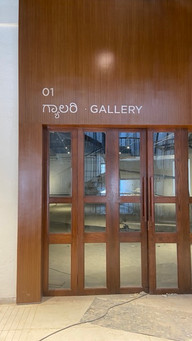
Typography choices were guided by linguistic priority and spatial harmony. Kannada was treated as the primary visual language, reflecting the gallery’s cultural context and ensuring prominence in wayfinding. Baloo Tamma was selected for Kannada for its rounded letterforms, inherent warmth, and high legibility without reliance on stylised variants. The English typeface was chosen to align structurally and visually with this character, resulting in the use of Gotham, whose geometric clarity complements the Kannada forms without competing with them.
Signage frames were kept predominantly vertical, echoing the vertical rhythms present in the gallery’s architectural elements. This alignment reinforces spatial continuity and allows the signage to integrate naturally into the environment rather than appear as an imposed layer.


Design process: Testing clarity in real space
The signage system was developed through a rigorous, site-responsive process. This began with a detailed study of site conditions—including circulation patterns, sightlines, lighting, and viewing distances—to understand how visitors move through and perceive the gallery. Typeface choices were then tested for legibility at multiple scales, ensuring clarity without visual intrusion. Color was introduced cautiously and evaluated for its impact on consistency and identity, as well as its interaction with walls, artworks, and ambient light.
Crucially, design decisions were validated through full-scale (1:1) mock-ups. Printed samples were tested on site to assess visibility, reading comfort, and overall feel within the actual spatial context. Feedback from these trials informed refinements before stakeholder approvals were sought. The process continued through 1:1 flex print testing, final production, and on-site guidance during installation—ensuring that the signage performed exactly as intended once embedded into the gallery environment.
Respecting Art and Architecture
Perhaps the most important guideline in this project was a commitment to respect for the art and architecture. The gallery’s renewed spaces—including dedicated galleries for Venkatappa and K.K. Hebbar, plus new galleries for contemporary and emerging artists—required a design approach that accommodates diverse artistic contents.
The environmental graphics do not compete for attention; they enhance spatial cognition. By keeping forms simple and integrating colour strategically rather than decoratively, the wayfinding system maintains a supportive presence—informing without interrupting, guiding without overwhelming.
A Framework for Engagement and Continuity
The revival of Venkatappa Art Gallery is an important cultural milestone, and the environmental graphic design is a key component of how this institution now communicates with its audiences. Through a simple, culturally relevant, and consistent visual system, we aimed to:
Help visitors navigate the gallery with ease
Support the architecture and exhibitions without overpowering them
Create an identity marker that reflects cultural context
Ensure clarity and consistency across all signage
In doing so, the design contributes to the gallery’s larger mission: making art accessible, legible, and engaging for all visitors—whether they are lifelong art lovers, students, or first-time spectators. By weaving wayfinding into the architectural experience, the gallery becomes not just a collection of spaces, but a coherent environment where meaning flows naturally from one encounter to the next.
Ultimate aim: Environmental graphics should mediate between space, art, and visitor—not dominate, but dignify; not distract, but direct. In Venkatappa Art Gallery’s revival, that delicate balance was the guiding principle of design.

Comments